Cloud DVR Series Manager
Improving the management of series recordings
Many of DirecTV’s most tenured customers cited the recording of episodic content as a primary reason for continuing to subscribe.
However, very few new customers were recording episodic content and the team was concerned that the new customers might not become as attached with the product if they didn’t start recording more episodic content as this is a key differentiated feature since there are very few competitors that are in position to offer this feature.
Company: AT&T TV
My Role: UI/UX
Platforms: Mobile, Tablet, Web, TV (Tizen, Roku, tvOS, Android TV, Osprey)
Tools: Sketch, Abstract, Adobe XD, Figma, Notion, Principle
Understanding the Problem
The team conducted research, including…
Broad customer surveys
NPS & sentiment analysis on social media
Video interviews with representative of each key customer segment
Analysis of help center and customer service inquires
Across all of these efforts, the team discovered one primary issue - users were often running out of storage and were actually being prevented from recording their first or next series. The reason users were running out of storage was because they didn’t fully understand how to manage their recording preferences.
• 75% of participants failed setting a recorded series, because language was confusing (i.e.: "First Runs Only")
• 54% of participants failed cancelling a recorded series. Many expected to cancel directly from the Recording playlist and, when they couldn't, struggled finding "Manage Recordings"
• Data suggests that some users manage their recordings by deleting shows one at a time after they finish watching, therefore bulk delete may not be solving for an existing pain point
Discovering Key Usability Issues

USABILITY ISSUE #1
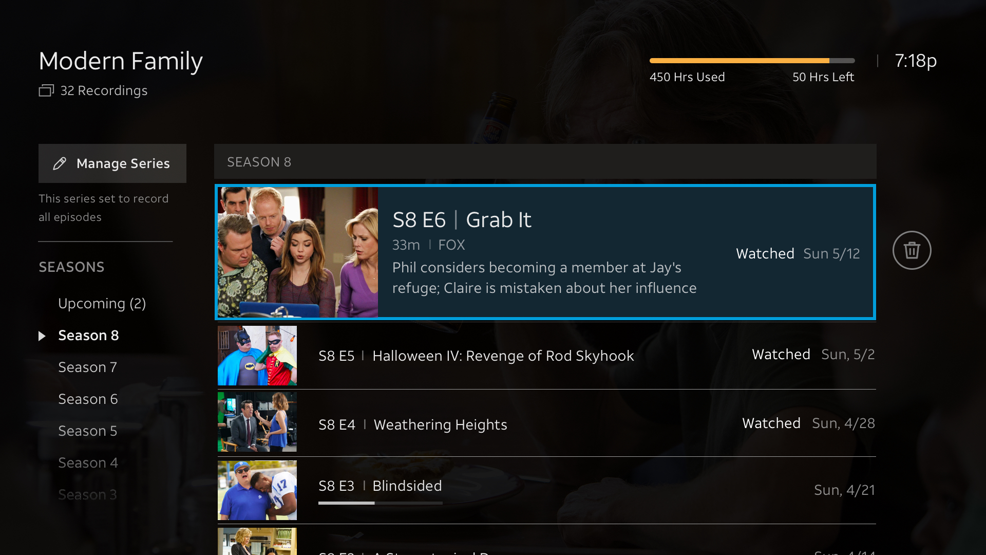
Path to canceling a series recording is hidden on DVR list.
Users could only cancel the series recording from the detail page, which was not intuitive and created an extra step. 45% of users had low accuracy with canceling a series recordings. Users expected to cancel series from within the series folder.
USABILITY ISSUE #2
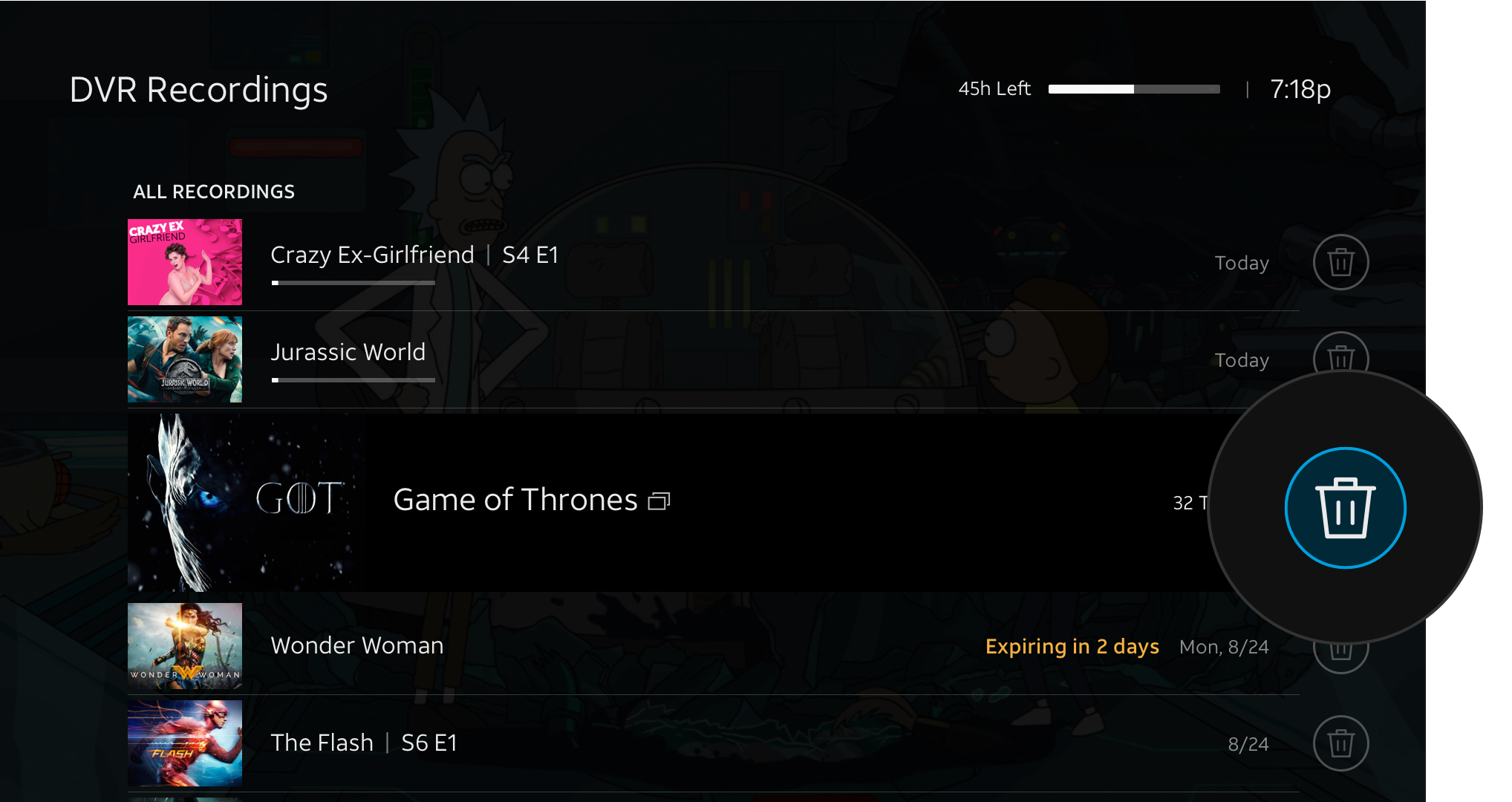
Deleting was mistaken for canceling.
Users assumed that selecting on the trash icon on a series folder canceled the series recording. Currently separate icons for deleting and canceling. Based on user testing, users don’t understanding between deleting and canceling icons.
USABILITY ISSUE #3
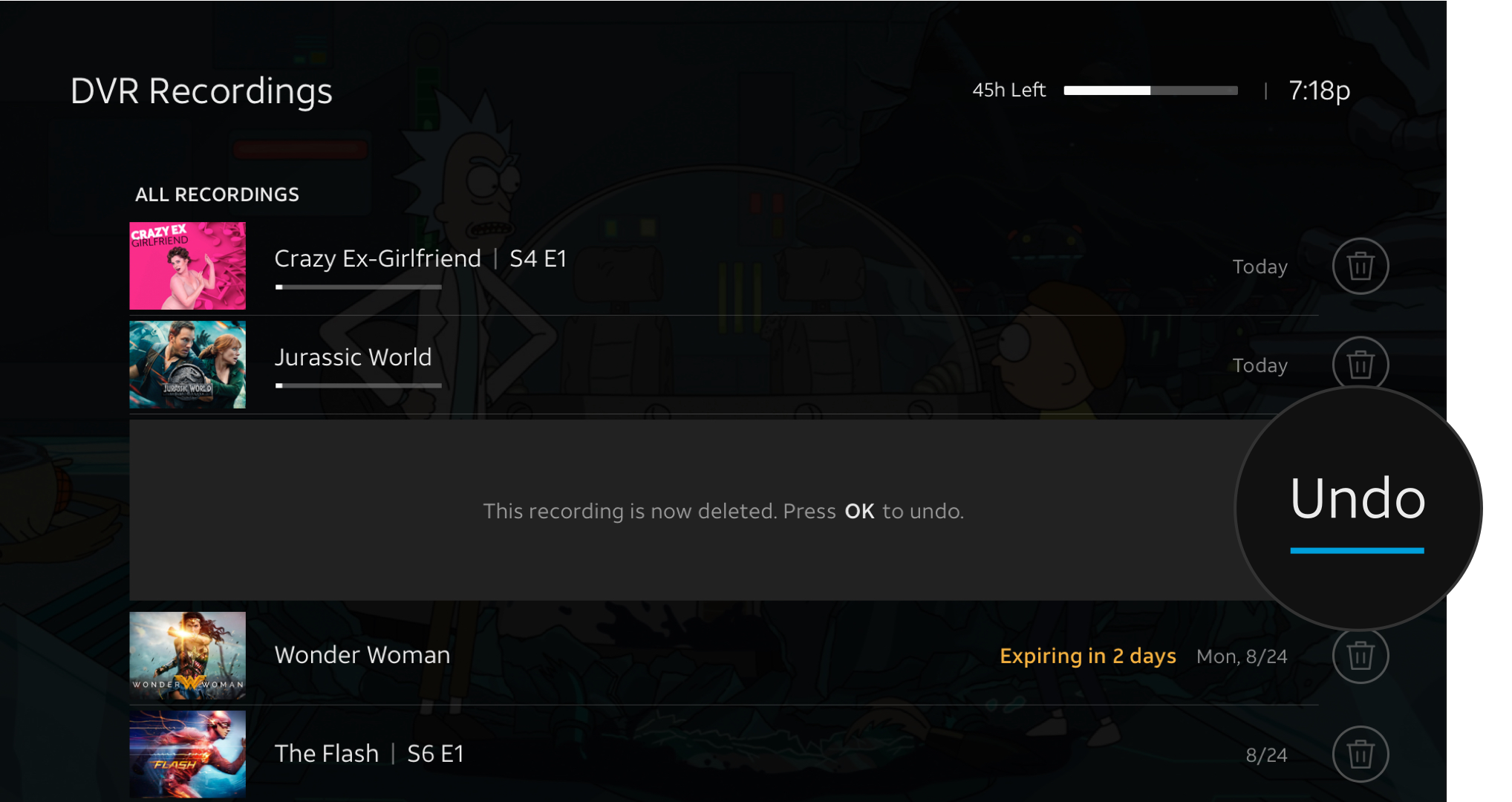
Users struggled to navigate out of Undo.
After deleting, users were prompted to ‘Undo’ in the message. This made them confused if they should Undo their deletion.
Iterating on Solutions
Based on the research, I designed several concepts and iterations…
Concept 1. Sub navigation - Exposed ALL Options

Exposed all options on Tab

2. Manage Series Tab > More CTA Options
Concept 2. Overflow CTA - Popup with Options

1. Overflow CTA

2. Select Overflow CTA
3. Cancel Series CTA on Modal

4. Canceling Confirmation
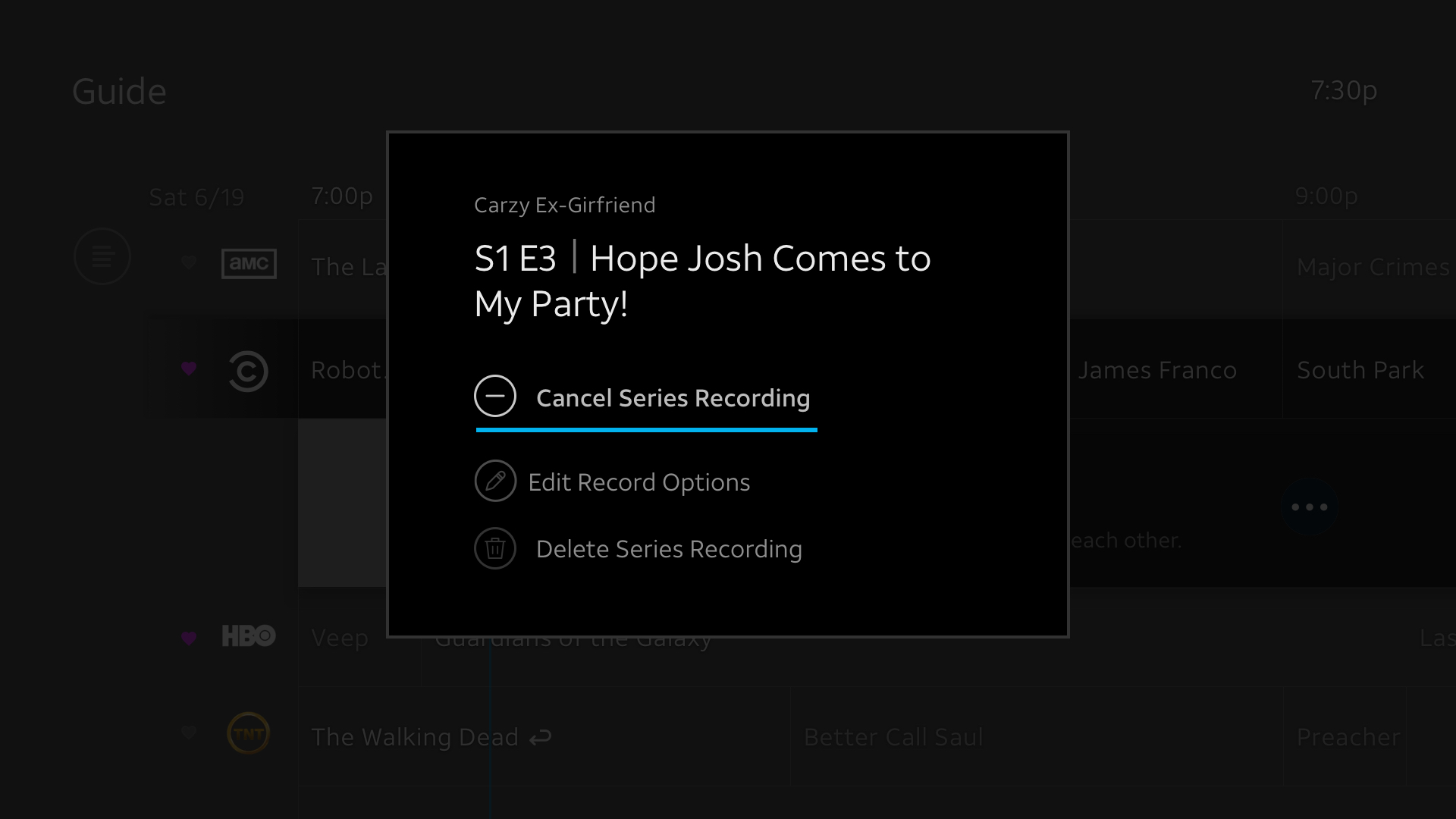
Concept 3. Cancel and Record options CTA - Exposed Options

1. Cancel & Record Exposed CTA Options

2. Change Recording Options CTA

3. Recording Options
Validating Solutions
I built prototypes and worked with the user research team to test these with users.

KEY TAKEAWAY #1
Cancel series option when deleting
From the DVR library screen, users liked the addition of the cancel series option when deleting because it felt contextual and informative.
KEY TAKEAWAY #2
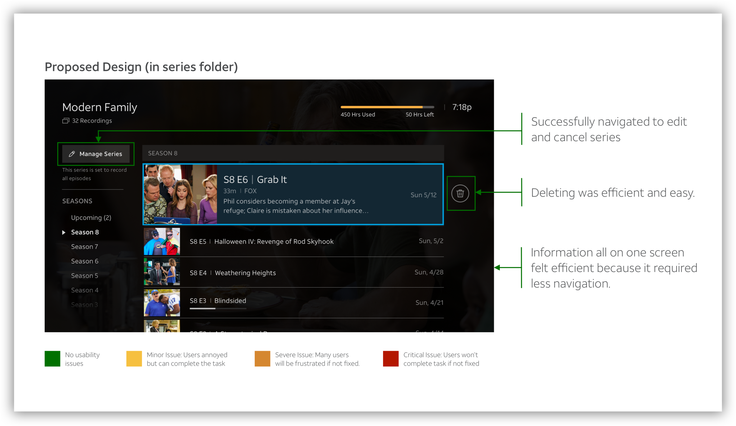
Users felt confident in canceling the series on series folder.
From the Series Folder, users felt confident in canceling the series because they saw a prominent button at top of the screen. Many expressed that this was where they would expect it.
The Outcome
Working with our Product Manager and Engineers, we prioritized a group of impactful changes we could implement
in a relatively short amount of time, including better series management and more contextual messaging.
Through these changes we were able to achieve a double digit increase in both the average number of series and episode recordings.